Search This Blog

Monday, March 11, 2019

The Hulk 16: "Masks" - a Review


The Hulk #16 (August 1979)
"Masks"
Doug Moench-Mike Zeck/John Tartaglione

What's that? A color comic, reviewed on a blog that touts the merits of the black & white magazines of the Bronze Age? Yup, but with a catch. Today's review comes to you from the Essential Rampaging Hulk, volume 2. That... is going to present some issues, as we'll soon see. If you were around this space a few days ago, you read my lamentations of those various Essentials and Showcase Presents that used color copies in production rather than original art. The reproduction problems could be egregious, and we'll get a heaping helping of that today. It's such an issue for me, in fact, that I'll be flipping my review format on its head.


But let's start with the now-familiar 100-Word Review:
We open on a dark street in New Orleans, with Bruce Banner’s attention grabbed - by a sharp object with a note attached. It’s obvious his assailant knows of Banner’s alter ego and implores Banner to show at the airport. He does, and meets Valerie and Jannar. They spin a tale of money, enough to finance Banner’s finding of a cure for his... gamma condition. But first - a test. Banner Hulks out and takes out a gator, and later is introduced to his would-be benefactor: Drago. Drago wants to enlist the Hulk’s aid to secure a Spanish treasure - half of which could lead to the end of the Hulk!
I've wanted to read the Rampaging Hulk mags for years. As a kid, I only had one issue, and it was pretty late in the run. I purchased the second volume via an Amazon 3rd-party seller. The book's in decent-enough shape and will serve my purposes. But darned if I didn't even consider that the book would have contained black & white reprints of color material. Which brings us to...


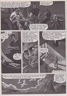
The Ugly: Man, this book was hard to read! I'll be honest - it detracted from my enjoyment of the story. I was able to get my hands on an actual copy of the magazine, and provide a few color scans today side-by-side with the Essentials pages that I scanned to show the difference. And my burden. As I remarked in the post last week, it was really a mistake whenever Marvel or DC had to shoot from color guides or color comics rather than original art in the creation of the Essentials or Showcase Presents. Those books overall were a great idea at the time - a ton of continuity for around $15-16. But I just can't take the way they read, and in today's case those pages that literally could not be read.


The Bad: This Drago dude looks like Terry Long. So while he is the "villain" of today's story, he gets extra baddie-points for being Terry Long's doppelganger. Terry Long... is he my least-favorite character in all of comics? He may be. Right up on the Mt. Rushmore of idiots alongside Snapper Carr and Dr. Druid. Come to think of it, I should consider that fourth spot on the Mount.

I thought the plot was just a bit thin. Drago came off as a typical mad scientist-type, while Valerie and Jannar seemed cookie-cutter lackeys. Banner's behavior also struck me as formulaic, but then I've never been cursed by the terror that is the Hulk. I guess I'd be desperate for a way out and would probably fall in with some seedy characters along the way as well.

There was one other quibble with the story, and this specifically falls to Doug Moench's script. If you look below, you'll find the last page of the story. The Hulk goes on a moralistic rant to Valerie and I wonder if Moench didn't lose the Hulk's voice momentarily. I find that as a possibility, or I've also wondered if he didn't show us a glimpse of Bruce Banner's half being somewhat in control. Either way I think it can be explained away... I mention it here only because I noticed that there was a departure from the Hulk's speech patterns from earlier in the story, a style that was quite familiar in the Bronze Age.


The Good: Call me positive if you will (you won't), but today I've saved the best thoughts for last. I did enjoy the story overall, and I think part of that sense is nostalgic. If you were a Rampaging Hulk reader when these stories were published, you recall that as the magazine progressed it had more and more of the feel of the television show that was airing weekly on CBS. Surely that was intentional, as Marvel sought to cross-market itself where possible.

Doug Moench, and I've said it before on this blog, has been a rising star among my list of favorite comics writers and that's wholly due to his work on the Marvel magazines. As I've remarked previously, I was certainly aware of him across my color comics reading, but I did not have the appreciation for either the volume of work he produced in the B&W format or for simply how good it is. Whether kung fu, monsters, sci fi, or here with a tragic hero, Moench delivers an entertaining read. Yes, I called the plot formulaic above, but I don't want to send the message that I didn't have several minutes of fun. I did.


Mike Zeck and John Tartaglione turned in nice work, as well. I enjoyed Zeck's depiction of the Hulk. His other characters stayed consistent throughout the story. Valerie was particularly beautiful. And sometimes the artist really earns his or her stripes when having to branch outside people. Zeck and Tartaglione really sold the airplane, the swamp setting, and the alligator. All-in-all a nice issue; but I'd still like to have been able to see it without the influence of the color.

Thanks for stopping by today. If you have thoughts on any of the issues I've raised, please leave a note below in the comments section.


Thursday, March 7, 2019

Guest Writer - Comics Are Better Than Candy!


We have a treat for you today, friends. Longtime contributor to the Bronze Age Babies, PFGavigan, is back with his first post for this space. Readers have long loved his prowess with online editing tools, in addition to his skill as an artist in his own right. Today he's along to share some memories from Halloween 2018, featuring (of course) comics. So buckle in and enjoy, and leave him a comment at the bottom. Thanks in advance for your participation on PFG's wonderful efforts today! -Doug


Monday, March 4, 2019

Spider-Man Newspaper Strips: Kraven the Hunter - a Review


Spider-Man Newspaper Strips, volume 1 (2009)
"Kraven the Hunter", October 31, 1977-December 25, 1977
Stan Lee-John Romita

Raise your hand if, back when you were a Bronze Age Baby, you peddled your bike to the local gas station or convenience store to pick up the daily paper that carried the Spidey newspaper strip. Yup - me, too! For me, it was around a 6-block ride to the Convenient Food Mart on Main Street. They sold the Chicago Tribune, and once Stan Lee had told me in the Bullpen Bulletins that the strip was starting, I started saving my pennies! I didn't get there everyday, but man - did I make the effort! I'm sure I clipped-and-saved, but darned if I know whatever happened to those strips. I also recall being somewhat disappointed that some of the arcs did not include the rogues gallery I'd come to know and love from the comics. If you don't have access to the strips, the first storyline featured Dr. Doom. I'm certain I don't recall that at all. I do, however remember an extended run that featured the Kingpin. But all that aside, today we're looking in on Kraven the Hunter! And a BWBC thank you/acknowledgement to Matt from the Not a Hoax/Not a Dream blog for his scanning (stolen and presented today) and to Al Bigley for the color Sunday strips (also stolen and presented today). Just so you think I'm not a total loser, I've also included some of my own photographs from the strips. There...

Let's roll, in the Mighty BWBC Manner!


100-Word Review:
Mary Jane Watson and Flash Thompson are on a working vacation in Florida, where they take in the animal act of Kraven the Hunter. Back in Manhattan, J. Jonah Jameson and city editor Joe Robertson debate sending Peter Parker to cover Kraven. But Jonah has an epiphany - if Kraven is the world’s greatest hunter, then why couldn’t he hunt a Spider? Robbie protests, and walks out the Daily Bugle’s door. Jonah hires Kraven anyway - and brings him to New York, and fisticuffs between he and our wallcrawling friend ensue. But… will Jonah sabotage Kraven’s victory?

The Good: What's better than a Stan Lee/John Romita collaboration on our favorite Web-spinner? Not much, unless you wanted to look for some Lee/Jack Kirby Fantastic Four stories? Let me warn you ahead of time: I'm going to contradict myself in the next section. But for now, I want to say that if the goal of the various Marvel (and DC, too) newspaper strips was to introduce our heroes to a wider audience, then this should be considered a success. All the elements you'd expect from a Spidey story are here - his supporting cast, Peter's "lovable loser" persona, an over-the-top villain with ego-stroking as his sole motivation, and so on. This story was a warm blanket on a cold day (which, as I'm writing this on 1/31/19, the outside temp is 5 degrees below 0).


You can argue with me if you like (you'll lose), but the characters in the Amazing Spider-Man universe are the best across all comics. I'll further posit that J. Jonah Jameson may be the best villain - super-powered or otherwise - in comics. He's a foil, an antagonist, a plotter & schemer, and a perpetual pain-in-the-butt. He doesn't have to wait 12-14 issues to reappear, because he's always there! And his presence is certainly felt on both ends of these shenanigans, from setting it up to bringing down the curtain... it's JJJ, all the way!


How good is John Romita? Really good. What a wonderful illustrator. Some would say that he doesn't take a lot of chances, that his style is very clean. For me, that's what I like about it. I've heard some say that once Kirby left Marvel, John Buscema sort of became the caretaker of the "house style". I can see that. But running through the Silver and Bronze Ages was the watchful eye of Romita. His steadiness in providing promotional art, book covers, calendar pages, etc. put the Marvel pantheon of characters in a nice, neat box. I appreciate him for that.

And Stan Lee? I like his Spider-Man writing perhaps best of all. I'd have to fist fight myself to see if I really enjoyed his Fantastic Four more, but those two books would be out in front with a gap to third place. I guarantee I like this stuff better than Lee's Silver Surfer, which can really wear on a man's patience if too many issues are read in close proximity. Hoo-boy... But here all of the voices just sound "right". And I love it.


The Bad: A little over six years ago, I reviewed this hardcover on the BAB. You can read my thoughts on the structure of the book itself, the layout and design, and also on the first story arc (again, featuring Dr. Doom). Let's just say the book, as a book, doesn't get high marks. I'll also add here that the reproductions of the strips seem uneven throughout the book. At times, it looks like they were able to shoot from the original art; in other places it appears that photocopies were used as the "original" imagery. However they did it, without color, the choppy lines are more noticeable.

I'm going to say something that I feel a little badly about writing. However, when you have some history in the rearview mirror with these characters, there's a sense of been-there, done-that. That's what I got when I read today's featured tale. As a peruser of many a Spidey comic over the past 45+ years, I hate to say I've seen it all, but hey - there just wasn't much new here. We had Peter's angst, Aunt May's ailments, Jonah's bluster, Kraven's megalomania, MJ's restlessness - it was all here. Now on one hand, you can argue that it's like comfort food. I can get on board with that. But if you're looking for anything that sets this story apart, you'll find yourself dissatisfied.

The Ugly: Zilch.


Please leave me a comment, whether it be on this story, the Spidey strips in general, or even other newspaper strips of the superhero (or Conan the Barbarian, too) variety. I have three trades that reprint the Batman strips from the Golden Age and hope to get to those at some point. I'd love to hear about your experiences with other strips. Thanks in advance!


Thursday, February 28, 2019

Discussion Point - Is Black & White Beautiful?


I've said many times, both here on this blog as well as on Twitter, that as a youth I eschewed the black and white magazines. When the Essentials and Showcase Presents "phone books" were released, I purchased a few but generally turned up my nose at the presentation of color material without... color. But lately I'm starting to have an extreme change of heart.

Since I began my love affair with the Bronze Age magazines - all of about a year ago - I have come to the conclusion that much of the art actually looks better in it's created form, sans color. I think the inks often add enough depth that in some cases, color would severely detract from the image or even from the entire book. This is not at all to give the impression that I now dislike color comics... far from it.


I'll even share a personal weirdity of mine: I really don't care to read comics in black and white that originally saw the light of day in color. I'm again speaking of Marvel's Essentials line and DC's Showcase Presents. I don't have an explanation for that hangup, as I am a big fan of original art, whether in raw form or as reprinted in the fabulous IDW Artist Editions (and their imitators). I think my issues may have to do with the reproduction process. If the comics in the Essentials (for example) were reproduced from pre-color sources, then they'll look clean. However, and this example specifically speaks to the Essential Avengers, volume 3, when the comics appear to just be photocopies of color pages there can be a really muddy look to the art. It reminds me of an anecdote I heard about the filming of Schindler's List. If you've not seen it (recommended/not recommended - it's a powerful film that will stick with you for quite some time after viewing), 98% of the movie is in black and white. But on the sets, in order to get the tones Steven Spielberg desired, actors would often be clothed in odd combinations of colors - all so the black and white would filter correctly and look pleasing to the eye. The shades would "make sense" in the final product. This is what I'm getting at with my sometimes-complaints about color comics reproduced in B&W.


I hope the samples I've provided, all previously seen in reviews here, help to show the textures available in the 1970s magazines that you just couldn't get in color comics. And especially with the printing process and paper quality in the Bronze Age. Here, where I see shading it is intentional and done with a deft touch that could probably be mimicked by today's coloring processes; not so 40 years ago. But don't get me going on computerized coloring...

Where do you stand (or sit) on this issue? Have the magazines of which you've partaken pleased your eyes? Do you find value in these works as art? Or are you a "color snob"? Jump in with a comment, and hopefully a nice discourse gets rolling. Thanks in advance!


Monday, February 25, 2019

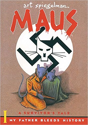
Maus: A Survivor's Tale. My Father Bleeds History, Chapter 2 - a Review


Maus: A Survivor's Tale. My Father Bleeds History (1986)
"The Honeymoon" - Volume 1, Chapter 2
Art Spiegelman

Last month I began a series of reviews of Art Spiegelman's masterpiece, Maus. In chapter one, we met our protagonists, Vladek and Art Spiegelman, father and son, respectively. We got a flavor of Vladek Spiegelman's personality in Art's present, and began to explore events in Vladek's life as a young man in pre-War Poland. We were also introduced to Art's mother Anja, deceased in the present. Now we move deeper into the biography of Vladek and Anja, while also becoming more aware of Art's tribulations as Vladek's son.

100-Word Review:
In “The Honeymoon”, Art Spiegelman reveals further layers of his father’s personality - much of it derived from his experiences before and during World War II. Among other things, we find that Vladek borders on obsessive/compulsive. We also learn that Anja had left-leanings, of which  Vladek and Anja’s parents disapproved. Art uses the incident of the “conspirations” with Anja’s Communist friend to show us the various factions in 1930s Poland - Jews, the Polish police (clamping down on the opposition), and the growing awareness of the neighboring Nazis. We see the birth of Art’s older brother, and witness the first reaction to the sight of the swastika.
I'd mentioned in my first review that when I originally purchased Maus, I read it cover to cover in one sitting. The chapters are relatively short, and I think it's that format that spurred me on each time I reached a stopping point. Also as I said before, the story is so engrossing... it just draws you in.

The Good: I've discussed Maus at length with colleagues at the United States Holocaust Memorial Museum. While most really like the story as a Holocaust biography, some are hesitant to embrace it as a learning resource. I've had a dialogue with one particular gentleman off-and-on through the years. His stance is that Maus works at too many different levels to be truly effective anywhere. What we've deconstructed is that, in his opinion, the shifting from past to present, the length of time spent on the relationships between Art and Vladek and Vladek and Mala in the present, and the ghosts of Art's brother and mother make the book an odd stew of sociology, anthropology, history, biography, autobiography, and memoir. I've rebutted that those "issues" are exactly the book's strength. With no intent to disparage any of the plethora of Holocaust biographies and memoirs, what sets Maus apart is not only its format as a comic book, but also how deeply it peels away the layers of people affected by the Holocaust narrative. One of the concerns among students of history, and specifically Holocaust history, is that we stand on the cusp of the day when there will be no Holocaust survivors, or liberators, or even perpetrators alive. Some worry how the story will be told once those 1st-person voices have gone. Many academics feel that they will have to rely on the children and even grandchildren of those principle players, a group of people known as 2nd- and 3rd-generation survivors. Although Art Spiegelman was born after the War, his life's experiences were almost wholly shaped by what his parents had endured in the 1930s-'40s.


I suppose for some it could be problematic that Art does not always specifically peg events narrated by his father with firm dates. This doesn't bother me, as there are just enough dates sprinkled throughout to help my mind move the story along across time and place. In fact, later we'll see a scene where Vladek begins to tell a story and Art stops him specifically to ask about the timeline. Some say this is a shortcoming to memoir - those writings are often stream-of-consciousness. That doesn't make it bad history; it's just history told from personal perspective. It has value.

We're not told at this point what happens to Anja after the War. By the end of chapter two we've been made aware that Anja was a small woman, that she came from a wealthy Polish-Jewish family, that she gave birth to Art's older brother, Richieu (and later to Art), that Richieu did not survive the War, and that after giving birth that first time Anja suffered a severe bout of post-partum depression. All of that serves as foreshadowing for what will be revealed later in this volume. It's also worth noting that two chapters in, it's somewhat difficult to ascertain the emotional depth of Vladek's and Art's relationship. There's been just enough said, and we're able to watch Vladek in his day-to-day activities, to suggest that's it is definitely a strained relationship. Yet we also feel that Art finds value in his father's past, and has a sense of urgency in recording his father's thoughts.


I've said little about the art, so here goes: It works. Sometimes I read Maus and I think the art is so simple; at other times I am astonished at the level of detail and emotion in each scene or even panel. I love the animal metaphors, and really like the scene in today's chapter when Vladek and Anja are at the sanitarium for her convalescence. Art also manages to convey impact with is choices of panel size, page layout, and backgrounds. He also uses a non-panel or broken panel format sparingly but to great effect. Having read interviews with Spielgelman, as well as his reflective memoir MetaMaus, I know how meticulous he was in trying to get things "right".


The Bad: I oscillate between being really put out with Vladek Spiegelman and pitying him. I guess where I land is in a state of personal tension. When he is "on screen", I just know he's going to say something that will set Artie off, or he'll do something worthy of slapping my head. But those are my reactions, and I find that I need to self-rebuke and remind myself constantly that he is a product of his life's experiences. In the first chapter overview I looked at some of Vladek's faults when he was a young man - his snooping around Anja's medicine cabinet, the focus on money, etc. We're all flawed, but none of those things would have brought him to the state he's in when Art conducts the interviews. Vladek was a changed man because of the Holocaust and the path his life ended up taking. For that, I feel ashamed of myself that I lose my patience with him.

The Ugly: Art does a masterful job of hinting at the rising tide of Nazism and antisemitism, and then drops it on us like a house. The 1/2-page image of the Polish Jews seeing the Nazi flag for the first time, followed quickly by four vignettes of antisemitic behaviors leave no uncertainties of where this story is headed. From this point on, we'll feel the downward spiral for Vladek and his family and associates. And along the way, we'll be amazed at the dangers they faced, and how Vladek often evaded the worst of it.


Thursday, February 21, 2019

Appreciating Joe Kubert's Tarzan of the Apes


When you think of Tarzan in the comics, do you think of the Western days and the work of Russ Manley or Jesse Marsh? Or do you go even earlier and recall in your mind's eye the newspaper strips by Burne Hogarth? If you're a Bronze Age Baby like me, perhaps it's the Tarzan seen in Marvel's series and illustrated by the brothers Buscema. Honestly, you couldn't go wrong anywhere across that spectrum, and I've certainly partaken of "all of the above" (and shoot - let's add the paintings of Boris Vallejo and Neal Adams that adorned the Bantam paperback covers to this love-in).

But today let's bask in the glory that was Joe Kubert's Tarzan, running from April 1972 to February 1977 and written/illustrated by Kubert. Kubert's Tarzan was lithe and athletic. The jungle-scapes were lush, the animals a sight to behold - truly off the realism scale. Knowing all this, I couldn't wait to purchase the first volume of the Joe Kubert's Tarzan of the Apes Artist Edition. At the time, I'd come into some cash from the sale of my collection. Those high-end books had become affordable. You should know that the things I treasure most about seeing original art are the evidences of the thought-process during creation - white-out, blue line pencil, eraser marks... those sort of things. But darned if Joe Kubert didn't nail it the first time. There were zero corrections that my eyes could find. None. Throughout the entire book! Sounds dumb to complain about clean original art, but I eventually sold it to make room for other Artist Editions I wanted. It's my hangup - I'll own it.

Leave a me thought on Kubert's Tarzan, and thanks in advance!


Related Posts Plugin for WordPress, Blogger...