Search This Blog

Thursday, November 14, 2019

Westerns!


Are you a fan of Westerns? Movies, comics, novels, or history? I'm a little bit "all of the above", but I'd not characterize myself as a true aficionado. I have enjoyed some biographies of various Western personalities, and Butch Cassidy & the Sundance Kid and Dances With Wolves are among my favorite movies. I only read a few Marvel reprints of Two-Gun Kid, Kid Colt, and Rawhide Kid when I was a lad, and those series being collected would be a purchase I'd consider making. Today I'm featuring a genre cornucopia. Each exhibit is labeled, so enjoy the work of several masters - and perhaps some artists you've not heard of.

Alex Toth

Mark Texeira

John Buscema

Russ Heath

Russ Heath

Fernando Fusco

Joe Kubert

Jose Luis Salinas

Bill Black

Jeff Butler

Joe Maneely

Jack Kirby

Reed Crandall

Gil Kane

Frank Frazetta

John Severin

Monday, November 11, 2019

"The Trench!" - a Review from Blazing Combat 4


Blazing Combat #4 (July 1966)
"The Trench!"
Archie Goodwin-John Severin

Back in September I featured a retrospective of Marie Severin's work, capped by a superior piece of King Kull art she drew in collaboration with her older brother John. This day you are treated to a beautifully-rendered tale from the Blazing Combat anthology, with John Severin flying solo on the art chores. I've said it before and I'll say it again - if you can get your mitts on the Fantagraphic Books hardcover collection of the four issues of Blazing Combat, do it! Cover to cover, it might be the finest book I own in terms of the quality of the interior art.

As was typical of Archie Goodwin's Blazing Combat stories, he wove tales of morality and of the horrors of war. This one - one of the shortest at only six pages - is well done and power-packed. Let's check out a brief overview:

100-Word Review:
World War I is winding down in spring of 1918 - still several months of bloody combat remain. In an Allied trench on the Western Front, men contemplate their lot - muddy, wet, the smell of death all around. The trench is hopeless, a virtual prison where death seems the only escape. Comrades leap to the top of the wall in a suicide bid; freedom comes only in covert missions under cover of night. One mission found a grizzled veteran crossing No Man’s Land with two of his commanding officers. The mission turned bad, and our soldier found himself sprinting for his life, to the safety of his… trench.

The Good: I love this book, and I love this story - and it's fitting given that today is Veterans Day (formerly known in the States as Armistice Day). Thirteen years before the Hallmark Hall of Fame presented the Richard Thomas/Ernest Borgnine version of All Quiet on the Western Front, Archie Goodwin and John Severin spun a vignette that could easily have been a included in that television film. Here is a clip from the opening scenes, which I feel dovetails nicely with today's review:


Even in Goodwin's opening statement, we're dropped into the horrors that were the seemingly unending life of the trench soldier. I could get a feel for the perpetual dampness, and just a few panels in Severin showed us a panel with "corpse rats", creatures so foul they lived among the soldiers as vultures, waiting for an opportunity to scavenge. The ceaseless threat to life, and the omnipresence of death, were on display as our protagonist's friend committed suicide simply by scaling the trench wall and making himself visible to enemy sharpshooters. While all these things should perhaps dwell in my "The Bad" section of this review, how well done these events are portrayed puts them squarely in the kudos portion of my writing.

John Severin offers a real depth to his characters. His use of shadows and varying lightsource angles offers an almost 3-dimensional feel, particularly on facial closeups. The trench is a character itself, and Severin uses it to create fear and death, but in the concluding panels warmth and safety. In Severin's telling, we experience fear, hopelessness, separation, loss, and after all that, a love for the familiar... and comfort from the very things only moments before had stimulated so many negative emotions.

The Bad: So much loss of life. In the introduction to the Blazing Combat collected edition, editor J. Michael Catron explains that several entities conspired to get the magazine canceled back in the mid-1960s - the United States military, the American Legion, and magazine wholesalers. As the Vietnam war escalated, the magazine was forced to cease publication. That was bad news, as the entire contents of the magazine served not necessarily as negative propaganda, but of the human realities of war. For that, Archie Goodwin and James Warren should be applauded, and it's a real shame there wasn't more.

The Ugly: War is Hell. And John Severin showed us. Nuff said.

Thursday, November 7, 2019

James Sherman's Legion of Super-Heroes


I dig me some James Sherman Superboy and the Legion of Super-Heroes art! At the time I was like "What the...?!" when Mike Grell left the book to take over the Green Lantern/Green Arrow feature. But it didn't take long to see the man's many merits. Don't believe me? Head on over to his website where you can check out some swell Legion color art as well as black and white versions of the Legionnaires and their powers, as depicted in the second Legion treasury. Great stuff!

Enjoy a sampling of Sherman's Legion work today. Most of it was inked by Jack Abel. I especially love the lighting features these two created, and the general depth of each illustration.

As usual, a hearty "thank you!" to all those folks around the WWW who make such things available for us commoners to ogle. Those people of course retain all ownership rights.


Monday, November 4, 2019

David Mazzuchelli's Daredevil Artisan Edition - a Review


David Mazzuchelli's Daredevil Born Again Artisan Edition (September 2019)
IDW Publishing

What are the comic book stories in your history that left you waiting impatiently for the next issue to arrive? In retrospect, it's probably a short list when you really consider a sense of anticipation that bordered on anxiety. For me, there are a few such times.
Notably, Frank Miller's The Dark Knight Returns would be one. And today's fare, coincidentally (or not) also by Frank Miller, is another.

I am not going to review the "Born Again" storyline, although I'd love to converse with any and all concerning just how awesome a read it is. In putting together today's post, I found that the photographing (the book is too large for my scanner), scanning (of the reprinted story), and cropping took quite a long time - I kept stopping and reading on each sample! So if you've never read it, I'd encourage you to find a copy of the trade, or pay for the individual issues (Daredevil #s 227-233) online.

My focus today is IDW's recently released paperback David Mazzuchelli's Daredevil Born Again Artisan Edition. I was not fortunate enough to get my mitts on the Artist Edition when it was published a few years ago, but I am eternally thankful to the original art gods that IDW chose this book to reissue in the somewhat-smaller-and-much-more-affordable format. The book clocks in at a thick 9"x12" (approximately), and is published on heavy stock. I don't believe it's as heavy or the same texture as original art board - which is the composition of pages in your standard Artist Edition - but it's nice. There are also several pages crafted of vellum, which I'll discuss a bit later. Although I come from a family of printers, there were some parts of the process that I didn't fully comprehend. Suffice it to say that printing in the mid-1980s was a bit more primitive than color separations allowed by current computerized tech. That Mazzuchelli could pull off his vision - and it was a vision - is amazing (at least to this reader).

As we commence, I've chosen some interesting panels and pages from the Artisan Edition. For comparison's sake, I've also included color panels. Although remastered, I do hope they provide the impact of the story's published colors. Christie Scheele colored six of the seven issues, with Mazzuchelli himself on one.

Leading off, above, is the first page of the Artisan Edition, followed below by the Table of Contents. I love the color choices on these pages. The khaki and crimson mesh quite nicely.


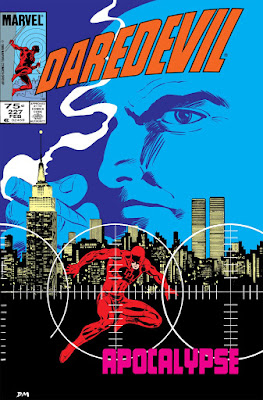
Next up, the cover to Daredevil #227. I vividly recall pulling this from the spinner rack in Eureka, IL while in college. I'd recently gotten back into comics after a multi-year hiatus during which I missed 90% of Miller's first turn on DD. If my aging memory serves, #227 was my second issue. Talk about hitting the ground running! Here we have a vellum overlay featuring the Kingpin and the crosshairs images. When put together, you can see the finished product. Again, I didn't completely grasp the technicalities of the printing processes of the day, but that Mazzuchelli could figure out "if I do this, then it will look like that" impresses me.


Turning the cover of the first issue let us know right away this wasn't going to be any sort of standard art job. Saying that is not to denigrate any other artists' work. But c'mon... look at that initial page and tell me Mazzuchelli didn't pour himself into this project from the start. Breathtaking... And note how reliant the mood is on blacks and whites in the published version. I can't decide which version of the page I like better!


Later in that first issue, there are two really nice sequences involving Foggy Nelson and Matt's (former) girlfriend Glorianna O'Breen. I have to declare that the original art is better. The use of zipatone is impactful. The first panel is from page 9; the second sample is found on page 13.


One of the neat little extras is a DD illustration to break the end of one issue and cover of the next.


Page 7, from Daredevil #228. The black background makes both versions pop:


At the end of the book there are several extras, including some samples of Mazzuchelli's pencil art. Below is page 12 from DD #228, with the published version:


Detail from Daredevil #228, page 15. I love the lighting on this street scene.


This sequence occurs early in Daredevil #229. Say, did you know that the first several issues in the arc include a person lying in bed, or at least in some state of repose? Check it out.


Later that same issue, Ben Urich's livelihood takes a turn (page 19):


I thought it was a great reveal when Matt figured out his healer's story. If you've not read this, I won't spoil it for you. This is page 2 from Daredevil #230:


This panel is found on page 10, and may be the single best panel in the entire story. Phenomenal use of lighting, and Miller nails J. Jonah Jameson. Just nails him. This is another sample that plays better in black and white.

Daredevil #231, cover:


In Daredevil #232 we are introduced to Nuke. Man, is he a treat. Great character, and perfect for this storyline. This panel is on page 4.

The Avengers show up in DD #233 to take down Nuke. Captain America is particularly interested in this rogue soldier. Note Iron Man's Silver Centurion armor. The first sample is page 9, followed by a couple of panels from page 22.


And to wrap things up today, another one of the extras at the back of the book is the original art for one of the trade paperback collections. This happens to be the cover of the edition I own. I read this story a few months ago, in anticipation of getting the Artisan Edition. As I said at the top, it's a great story. And I'm just a lover of original art and of seeing the creative process. This book did not disappoint.


Related Posts Plugin for WordPress, Blogger...