

What's your experience with Val Mayerik? Mine comes largely from the B&W "Frankenstein 1974" series, when Marvel decided it would be a good idea to bring the Monster into then-present continuity. Of course, that would give us a Marvel Team-Up with the Amazing Spider-Man, but also create a generally odd situation. But I digress...
Mayerik also made his presence felt in Savage Sword of Conan, and had a history with Howard the Duck. How's that for variety?
Anyway, enjoy these samples of his work - and thanks to all those spaces around the World Wide Web who host the images I've provided here today.
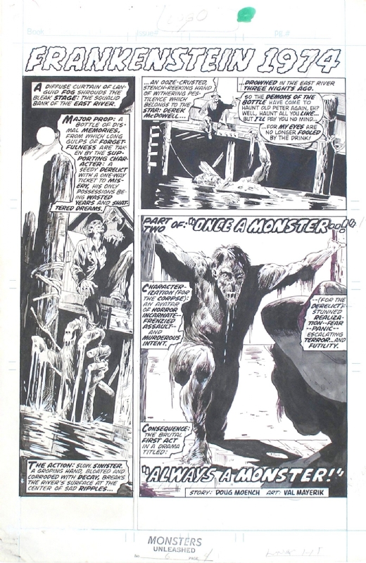


I've known Mayerik's work primarily from his early art on Man-thing; have never seen the Frankenstein pages. Which, by the way, look great. Presumably Val both pencilled and inked those?
ReplyDeleteGood morning, Redartz!
DeleteI don't have my Frankenstein tpb handy, but a very quick search of some databases showed that sometimes Mayerik inked himself, sometimes there was a different artist in collaboration. I can't speak directly to the samples provided without my resource.
Sorry!
Doug
I remember Val Mayerik from his art on THE LIVING MUMMY which appeared in Marvel UK'S DRACULA LIVES weekly.
ReplyDeleteMy experience with Mayerik mainly consists of Man Thing, Howard the Duck and the Living Mummy stories from Supernatural Thrillers. I did not, however, read any of these when they originally came out in color comics, but rather in the Essentials volumes. So I'm mainly familiar with his work in the b&w format.
ReplyDeleteThat's an interesting perspective, Edo (and Colin, too) - seeing color work but only in a B&W format. I wonder if you then saw the color version if it would look strange to you?
DeleteDoug
Val's style is unmistakable. Very fluid, very expressive. The Marvel Graphic Novel Void Indigo is one of the best examples of his technique (fully painted art, not b/w).
ReplyDeleteI have to admit my only exposure to Mr Mayerik's art is in the pages of Harvey Pekar's "American Splendor" comic....and fine work it is too.
ReplyDeletePerhaps I should be ashamed to admit, but I've never read American Splendor...
DeleteDoug
Doug, I first read the classic PANTHER'S RAGE in b&w (in Marvel UK) but I recently saw a review of the series in the original colour on the blog PEERLESS POWER OF COMICS. It did indeed look strange and I made a comment about it (in my opinion Panther's Rage had looked better in b&w).
ReplyDeleteColin -
DeleteI've remarked before that I have grown to really love these black-and-white magazines. However, I've also stated that I can have a distaste for bad reproductions of color art in B&W (see my review of The Hulk #16 and check out the samples; contrast that with my review of MTIO #7). For whatever reason, and maybe like you, my mind's eye tends to think a book looks "right" in whichever format I first laid eyes on it.
Panther's Rage is a storyline I need to revisit. I've read it once, and found it underwhelming given the hype. The art and lay-out was spectacular, however. Maybe I'll get to it this summer.
Doug
Yeah, Man-Thing originally for me, and Noir is right, Void Indigo is great.
ReplyDeleteI always like the way Val's character look like melted wax or candle figures ( That, by the way, is a compliment!)
Understood and agreed, Pete - and I think some of the art samples from Frankenstein 1974 certainly bear that out.
DeleteDoug