Search This Blog

Showing posts with label Frank Miller. Show all posts

Monday, November 4, 2019

David Mazzuchelli's Daredevil Artisan Edition - a Review


David Mazzuchelli's Daredevil Born Again Artisan Edition (September 2019)
IDW Publishing

What are the comic book stories in your history that left you waiting impatiently for the next issue to arrive? In retrospect, it's probably a short list when you really consider a sense of anticipation that bordered on anxiety. For me, there are a few such times.
Notably, Frank Miller's The Dark Knight Returns would be one. And today's fare, coincidentally (or not) also by Frank Miller, is another.

I am not going to review the "Born Again" storyline, although I'd love to converse with any and all concerning just how awesome a read it is. In putting together today's post, I found that the photographing (the book is too large for my scanner), scanning (of the reprinted story), and cropping took quite a long time - I kept stopping and reading on each sample! So if you've never read it, I'd encourage you to find a copy of the trade, or pay for the individual issues (Daredevil #s 227-233) online.

My focus today is IDW's recently released paperback David Mazzuchelli's Daredevil Born Again Artisan Edition. I was not fortunate enough to get my mitts on the Artist Edition when it was published a few years ago, but I am eternally thankful to the original art gods that IDW chose this book to reissue in the somewhat-smaller-and-much-more-affordable format. The book clocks in at a thick 9"x12" (approximately), and is published on heavy stock. I don't believe it's as heavy or the same texture as original art board - which is the composition of pages in your standard Artist Edition - but it's nice. There are also several pages crafted of vellum, which I'll discuss a bit later. Although I come from a family of printers, there were some parts of the process that I didn't fully comprehend. Suffice it to say that printing in the mid-1980s was a bit more primitive than color separations allowed by current computerized tech. That Mazzuchelli could pull off his vision - and it was a vision - is amazing (at least to this reader).

As we commence, I've chosen some interesting panels and pages from the Artisan Edition. For comparison's sake, I've also included color panels. Although remastered, I do hope they provide the impact of the story's published colors. Christie Scheele colored six of the seven issues, with Mazzuchelli himself on one.

Leading off, above, is the first page of the Artisan Edition, followed below by the Table of Contents. I love the color choices on these pages. The khaki and crimson mesh quite nicely.


Next up, the cover to Daredevil #227. I vividly recall pulling this from the spinner rack in Eureka, IL while in college. I'd recently gotten back into comics after a multi-year hiatus during which I missed 90% of Miller's first turn on DD. If my aging memory serves, #227 was my second issue. Talk about hitting the ground running! Here we have a vellum overlay featuring the Kingpin and the crosshairs images. When put together, you can see the finished product. Again, I didn't completely grasp the technicalities of the printing processes of the day, but that Mazzuchelli could figure out "if I do this, then it will look like that" impresses me.


Turning the cover of the first issue let us know right away this wasn't going to be any sort of standard art job. Saying that is not to denigrate any other artists' work. But c'mon... look at that initial page and tell me Mazzuchelli didn't pour himself into this project from the start. Breathtaking... And note how reliant the mood is on blacks and whites in the published version. I can't decide which version of the page I like better!


Later in that first issue, there are two really nice sequences involving Foggy Nelson and Matt's (former) girlfriend Glorianna O'Breen. I have to declare that the original art is better. The use of zipatone is impactful. The first panel is from page 9; the second sample is found on page 13.


One of the neat little extras is a DD illustration to break the end of one issue and cover of the next.


Page 7, from Daredevil #228. The black background makes both versions pop:


At the end of the book there are several extras, including some samples of Mazzuchelli's pencil art. Below is page 12 from DD #228, with the published version:


Detail from Daredevil #228, page 15. I love the lighting on this street scene.


This sequence occurs early in Daredevil #229. Say, did you know that the first several issues in the arc include a person lying in bed, or at least in some state of repose? Check it out.


Later that same issue, Ben Urich's livelihood takes a turn (page 19):


I thought it was a great reveal when Matt figured out his healer's story. If you've not read this, I won't spoil it for you. This is page 2 from Daredevil #230:


This panel is found on page 10, and may be the single best panel in the entire story. Phenomenal use of lighting, and Miller nails J. Jonah Jameson. Just nails him. This is another sample that plays better in black and white.

Daredevil #231, cover:


In Daredevil #232 we are introduced to Nuke. Man, is he a treat. Great character, and perfect for this storyline. This panel is on page 4.

The Avengers show up in DD #233 to take down Nuke. Captain America is particularly interested in this rogue soldier. Note Iron Man's Silver Centurion armor. The first sample is page 9, followed by a couple of panels from page 22.


And to wrap things up today, another one of the extras at the back of the book is the original art for one of the trade paperback collections. This happens to be the cover of the edition I own. I read this story a few months ago, in anticipation of getting the Artisan Edition. As I said at the top, it's a great story. And I'm just a lover of original art and of seeing the creative process. This book did not disappoint.


Thursday, December 27, 2018

Frank Miller's The Dark Knight Returns Gallery Edition - a Review


I hope the holidays find you well. Today I'm reblogging a review I wrote close to 2 1/2 years ago on the Bronze Age Babies blog. I'm running this as is - you'll notice near the end I reference a Jack Kirby Artist Edition. You can bet your bottom dollar I'll get to that at some point in the near future. But for now, enjoy the incredible original art of Frank Miller and Klaus Janson from the landmark Dark Knight mini-series.

THIS POST WAS ORIGINALLY PUBLISHED ON 5 JULY 2016 AT BRONZE AGE BABIES.


Frank Miller's Batman: The Dark Knight Returns Gallery Edition
Graphitti Designs, May 2016

Doug: Hey, I'm not one to toss about texting lingo, but

OMG

Is this a cool book, or what? (Yes, it's a very cool book, as I think you'll see.)

First off, the nuts and bolts of the book, courtesy of the folks at Comic Book Daily --
Batman: The Dark Knight Returns – Frank Miller Gallery Edition
Includes artwork from Dark Knight Returns 1-4, covers, related art and previously unpublished pieces. Though Graphitti Designs was unable to locate every original from this story, they are pleased to present to fans everywhere the best presentation of the artwork from this historic series ever seen.
Some may see the price and think "no way", and I'd most likely be in that camp as well had I not been earning revenue from the sale of my collection. I pre-ordered this book from Westfield Comics in Wisconsin; I'd done business with them as a subscriber during my college years and was pleased to make their acquaintance once again. They sold me the book in October for $148 (which included S&H), and I waited patiently through two publication delays before getting my mitts on the book on June 9. As you can see from the tale of the tape above, it is big -- way bigger than the average Artist Edition from IDW (though not as large as the twice up John Romita's Amazing Spider-Man or my pre-ordered Jack Kirby's Thor (already delayed and now due to arrive this week)) and weighing in at close to 10 pounds. Not exactly the sort of book one would rest on the lap.

Here are a few of shots of the packaging -- the book's transit appeared to have been smooth. The cardboard "case" is standard for these types of books, as IDW uses the same product. I keep all of my Artist Editions nestled in this original packaging. Note: All images henceforth are photographs -- I'd have gotten a hernia attempting to scan from this monster.


I've also included an image of the inner spine of the book to show the stitching. The craftsmanship is solid, and what's especially nice is that although it's not a "lay flat" book it does not want to close once opened. I could look at it or read from it without having to hold down pages on either side.


Below are shots of the title page, as well as the back cover (just ignore my reflection in that pic). The image of Batman towering over the Gotham City skyline was the cover of the first Warner Books trade paperback (which I owned at one time before a colleague to whom I'd loaned it lost it); it was also a 16"x20" poster, which I also own.


And here, kids, is where the awesomeness begins. Below you'll find a vellum (not sure if that's the exact nature of the material, so I'm going with it anyway) overlay with Frank Miller's original pencils to the cover of The Dark Knight Returns and the finished graphic design that saw publication. You can see how the color version shows through the top sheet. I'll have several more examples of this feature of the book.


I sent all of these images to Karen shortly after I received the book. One of the things she remarked about was her love of the margin notes. Those of you who have read Miller's collaboration with Bill Sienkiewicz, Elektra: Assassin, know that Sienkiewicz repeated certain images, and often. Note below that Miller's bottom left panel is marked for "stat" and is repeated two panels to the right.


As you saw from the product description above, Graphitti Designs could not locate all of the pages. They do, however, include scans of the published pages for the purpose of completion. Below is a common example; however, when a page in question is paired with a vellum overlay the scanned page is full-size to match the size of the overlay. The coordination of the printing and bindery process in this book was meticulously carried forth.


The two pages below are here to show you the creative process of Miller and Klaus Janson. Lots of white-out, stats, etc. The second of these two pages is my favorite vignette in the entire graphic novel. When I first read this page, I knew this wasn't any Batman I'd known. I had a "heck yeah!" moment during that first reading.


Note Miller's signature on the bottom of the page above (enlarged detail below).


The scene below was pretty tense -- love the splash page of Batman with the chest logo blown open to reveal a bullet-proof vest. Note the creative process in the enlarged detail.


In another example of the overlay, you'll find Miller's pencils to the cover of The Dark Knight Triumphant on the left, and Janson's inks on the right.


Another example of white-out, as well as Miller laying out a grid system for the building heights and the lettering. Note the margin call-out to the punctuation in the word balloon. Note also that Janson signed and dated this page -- lucky for whoever owns it!


Two more examples of editing and mark-ups.


Great image on the left, below. Given that Janson signed here, and the page above, both in June of 1986 has me wondering if the same collector owned both pages.


Miller and Janson both signed this page. Memorable panel from The Dark Knight Triumphant.


The cover of Hunt the Dark Knight was just plain white, except for the image of Carrie Kelly in the bottom right corner. A graphic designer must have done the Bat logo.


Detail of a single panel, when Bruce and Clark were riding horses and discussing the coming storm. Miller did not care for Janson's inks, so re-inked the image himself. The overlay at right is Miller's version.


I thought this was interesting -- several panels redrawn by Miller. It seemed that as the story wore on he became fussier about the work. For those of us who bought the book as it was released, this might explain the longer and longer delays as the series progressed.


Awesome splash...


Again, enjoy the process. And Miller's tinkering. I'll tell you, looking through this book it struck me how much Miller must feel the same way about this work as George Lucas feels about his original trilogy of Star Wars films. Perfection is an unattainable thing.


Detail. White-out and redrawing. I love seeing stuff like this!


One of the iconic images of the entire series. I thought it would be cooler than it is, but for the most part it looks like Miller and Janson were satisfied the first time. Or, perhaps it's because of the tardiness of the series that there was no reworking here.


Near the end of the book there are several extras. As you may know, all of these original art collections are color scans of the art. That's why you feel as if you're looking at the actual bristol board and it's also why all of the white-out, blue line pencil, and even eraser marks are visible. Near the top you saw that there's no shortage of color images. I was surprised to see this huge fold-out at the back of the book. If you were buying this back in the day, you may recall a large counter display when The Dark Knight Triumphant was released. This is a reproduction of the artwork for that display. Nice touch, Graphitti!


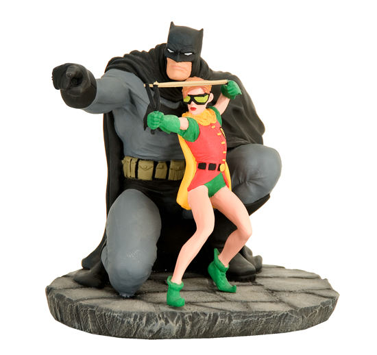
Lastly, here are a couple of other promotionals. On the left is Miller's design for a Dark Knight statue, while on the right is his portion of the cover to 'Mazing Man #12 (June 1986).


I hope you enjoyed the tour. I've been through the entire book three times and just love it. Of the original art reproductions that I own, this is one of the best. Of course, all this may change when the Kirby one arrives in a couple of months. You know I'll keep you informed...


Related Posts Plugin for WordPress, Blogger...