Search This Blog

Showing posts with label Jim Mooney. Show all posts

Wednesday, January 22, 2020

Super Blog Team-Up: Shades of Gray - a Review of Spectacular Spider-Man 1


Spectacular Spider-Man #1 (July 1968)
"Lo, This Monster!"
Stan Lee-John Romita/Jim Mooney

Welcome back, friends, to this space as well as to another round of Super Blog Team-Up! This time around we're looking at gimmicks and excess in a theme called "Chromium". While that might seem to have a 90s or 00s vibe, you know this blog hearkens back to the Bronze and sometimes Silver Ages. And that's what I have for you today - a review of a book that lands squarely in that transition from the Marvel Comics of the 1960s heading into the 1970s.

The Spectacular Spider-Man was the brainchild of Marvel's Editor-in-Chief, Stan Lee. Always seeking new ways of keeping Marvel fresh, and narrowing the gap with the Distinguished Competition, Stan could be daring when twisting publisher Martin Goodman's arm. Warren Publishing, MAD Magazine, et al. had already created a market for more adult-themed comics, so Stan wasn't exactly inventing the wheel. Despite its timing, Spectacular Spider-Man was a beautiful book and truly a shame to have been a one-and-done in the black-and-white format. The second issue, in full color and featuring the Green Goblin, stands as one of the great Spidey stories of the Lee-Romita era.

Take a peek at the Bullpen Bulletins at left, and enlarge it. You'll see some typical Stan Lee huckstering, both in the third "Item!" as well as in The Mighty Marvel Checklist. Nearly sold out? Stan even remarks that Jazzy Johnny couldn't find it in his own neighborhood! Know what? I think he was right. Sales figures (I've looked for some exact numbers, but can't locate them) were presumably swell for the first issue, yet Goodman elected to print the second ish in color. We all know that the third issue never saw the light of day. So what happened? My guess is, from everything I've read across numerous histories of Marvel Comics, that Martin Goodman's impatience and general skittishness at potentially losing a nickel most likely ruled the day. It would be another three years before Marvel took the magazine plunge again, with 1971's Savage Tales. And even then, that mag would see a start-stop-start genesis.

NOTE: This book would have landed at the drug stores and supermarkets in between Amazing Spider-Man's 62 (featuring Medusa) and 63 (with the Vulture).

But enough backstory... let's get on with my thoughts on today's selection.


100-Word Review:
Richard Raleigh is a mayoral candidate who has charmed the populace of New York City. But a man-mountain of an assassin apparently wants him dead. Encountering our favorite Webhead, the mystery deepens as Spidey is unable to defeat the monster. Later, various underworld factions take shots at Raleigh. Behind-the-scenes, we find that Raleigh’s not the good guy who’s endorsed by J. Jonah Jameson’s newspaper. Rather, he’s scheming for power by creating plots that seem to run against himself. Can our hero protect his loved ones and the city, and defeat the 10-foot giant bent on killing Captain George Stacy?
The Good: Do you mind if I go on about the art for the next three hours or so? Yeah, that would be excessive. Let's see if I can be a bit more concise. I loved it! Since we're talking gimmicks and marketing today, some of our time should be spent on the black & white art. MAD Magazine was selling a little less than two million copies monthly; we know Warren was well-established by 1968. But no Marvel title had pursued this style yet - Stan's decision to dip his toe into this water could have been a disaster on many fronts: sales, fan response, execution, etc. But wow - did Jazzy Johnny and Jim "Madman" Mooney nail it. This book is beautiful. I read/scanned from the The Amazing Spider-Man Epic Collection, volume 4 - admittedly remastered. I think this would have played well on regular ol' newsprint, too. I used to own a copy of Spectacular Spider-Man #2, and I can tell you that it was printed on standard comic book paper of Silver Age vintage. I'm pretty sure the Marvel magazines of a few years hence would be printed on slightly different paper quality. Anyway, I hope you'll agree with me (based on the samples I've provided) that the pictures are simply stunning.


I've remarked in previous reviews that when I see John Romita's Spider-Man and his cast of characters, it just feels like a comfortable pair of jeans or a warm blanket. This is the way these characters are supposed to look. Yes, Spidey's been blessed with a wonderful stable of artists through the years. But for me, everyone's compared to Romita. I'll get to Stan's script shortly... had it been the most gawd-awful piece of trash (which it wasn't), I'd still have had the pretty pictures to look at. Case in point: The three pages below serve as microcosms of my joy. On the left, the second panel with Spidey's mask sort of washed out is a solid effect. In the middle page, the large panel at bottom showcases four of our main characters and shows why Romita is my gold standard. And finally, the third selection seems a preview of pages we'll see in a few years from the likes of Ploog, Wrightson, Buscema, Mayerik, and some of the other B&W and horror masters.

Regarding the supporting cast, I really think their voices lived in Stan's head. Each one is distinctly presented throughout Stan's tenure as writer. Romita helped by giving each a unique look that remained consistent throughout his years on the book and became the template for Gil Kane, Ross Andru, Keith Pollard, and so on.


Richard Raleigh and his man-monster were effective villains in a story that sought original content. Both characters were bombastically over-the-top and effective as psychological and physical menaces to our wall-crawling hero. I liked JJJ's blind allegiance to the cult of personality Raleigh had crafted, and the opposition of Captain George Stacy. Stacy's skepticism and subsequent investigation of Raleigh proved a nice antagonism to both the candidate and to Jonah. Side Note: After writing this review, I started reading at the beginning of the Epic Collection that was my source. George Stacy had only been introduced within the preceding year to this story's publication, and his star had risen quickly. By the time Stacy would meet his demise in ASM #90, he'd only been around for 40 issues or so - a quite short "lifespan" as a somewhat-major supporting character.


The Bad: I was a bit worried as this story was beginning that Stan's script was going to whither beyond the pedestrian effort that limped out of the gate. Through the first three pages, this felt like one of the newspaper strips that would be published a decade later. I understand that, given the format and price increase (35c, when Annuals sold for a quarter) there may have been new readers who needed to be brought up to speed. But I was having a tough time getting past all the cliches. Fortunately, after the initial too-long battle, the story settled in and became what we'd call "regular Spidey fare". 

It seemed to me that Spider-Man might have drawn on Peter Parker's science knowledge in a bit more of a detailed manner when deducing how to defeat the big ugly. The climax felt more the result of luck than of Spidey actually using that genius mind that dwelt beneath the mask.

And speaking of a too-long battle, whenever I get about halfway through one of these 52-page monsters I begin to question my stamina. This was a lengthy piece of literature!


The Ugly: I got nuthin'. Fun read, fun format, easy on the eyes - it's what comics and comics magazines should be.

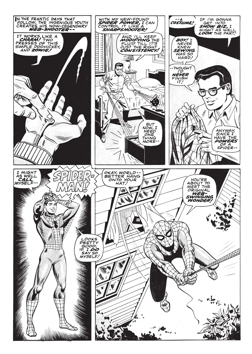
Before we get to some more good stuff, I wanted to show an art sample of the 10-page retelling of Spider-Man's origin, the back-up to our main feature. Stan wrote it, and art was provided (quite solidly, I might add) by Stan's brother Larry Lieber with inks by the ever-stellar Bill Everett. It's a collaboration that paid some serious dividends.


Please patronize my partners in blogging and podcasting today and in the coming days. You will find it's time well-spent!  

  
Super-Hero Satellite: 70s-80s Photo Covers. A snapshot of pre-90s era of gimmicks, the evolution of a trend through the years.

Chris is on Infinite Earths (Blog): Adventures of Superman #500 (White Bag/Lenticular Cover/etc.)

Chris is on Infinite Earths (Podcast): Episode 33: Team Titans #1 (1992) -Five Variant Covers… and five variant stories!


ComicsComicsComics.blog - Daredevil 319-325: Fall from Grace (Gimmick covers and a new costume)
 

Between The Pages - Guerilla Marketing

DC In the 80s - Justin’s 5 most memorable DC “gimmicks” (1990 - 1995): Robin II hologram covers, Spectre glow-in-the-dark covers, Justice League Task Force #1 with JLA membership card, Batman Shadow of the Bat #1 collector’s issue, #5 undecided. Mark’s most memorable DC comic cover “gimmicks” (1980 - 1989)  


Comics In The Golden Age -Fawcett’s Mighty Midget comics.

Unspoken Issues - Darkhawk #25

Dave's Comic Heroes Blog - Connected Covers gimmicks: New Teen Titans 37/Batman and the Outsiders 5

When It Was Cool - Polybags!


Monday, January 14, 2019

Evolution's Nightmare - a Review from Planet of the Apes 5


Planet of the Apes #5 (February 1975)
"Evolution's Nightmare"
Doug Moench-Ed Hannigan/Jim Mooney

I read this story for the first time about two weeks before Christmas, at the back of the Planet of the Apes Archive, volume 4. It was the final Apes story reprinted in those fabulous hardcovers from Boom! Studios. And I'll say that while I was "Meh..." about the inclusion of all of the articles in the Deadly Hands of Kung fu Omnibus, I really missed them in the recent PotA Archives. I can recall, as a child, generally skipping the comics within the PotA mags and skimming the articles at the grocery store. Stills from the films, especially those dealing with production aspects of the make-up, etc. were enthralling to my young eyes. But as was my condition back then, I was allergic to black & white comics... Dumb me.

I wondered as I read through the four PotA Archive collections how it was arrived to organize the books as they did. At times I felt, and I suppose this is the most practical way, stories were fit into the page allotments of each volume. Sort of like working a literary jigsaw puzzle. Today's offering is a case in point - first appearing in the 5th issue of the PotA magazine, it was the last tale to be included in the the hardcover series. One might argue they saved the best for last, though, as it is a pretty good story. Let's check it out --


100-Word Review:

War rages on the Planet of the Apes in a time long before Taylor’s arrival. Armed humans on one bluff, equally-equipped Apes across from them, with a Forbidden Zone valley the site of what will become near-complete carnage. Yet two survive the drenching of blood – Jovan the human, and Solomon the gorilla. Mutually disabled post-battle, they are forced to collaborate for survival. Setting off in a symbiotic relationship, they encounter the mixed-breed hermit Mordecai. A man-ape of thought and good will, Mordecai nurses the former combatants back to health. But once healed, their hatred still burns. Will it consume them?


The Good: What can I say about Doug Moench's tenure as scribe of these Apes adventures that others have not already said? I certainly was aware of Moench's various writings when I was a child (and onward), but I don't know that I comprehended just how prolific he was - and especially in the B&W mags. Having taken the complete tour of the PotA magazines over the past two years, I think I've elevated Moench in my personal rankings of the pantheon of comics writers. What an imagination, and a true mastery of pace, plot, and parlance. This story is certainly no exception. While the theme is borrowed, that of two former combatants forced to rely on each other for survival, Moench throws this into the apes/humans dichotomy with that extra flair that resonates with the watcher/reader of the PotA mythos. I found myself on the edge of my seat, waiting to see how these sworn enemies would resolve their foundational issues. I was not disappointed, even though the morality play conclusion seemed predictable. 

The introduction of the hermit Mordecai proved pivotal, and it was a stroke of genius to craft the character as a human/ape hybrid. Of course, that raises all kinds of other issues (moral, biological, and so on), but maybe that's the point: If Mordecai could grow from a union that would undeniably be considered taboo among the races (nay... species) of his parents and be a fount of virtue, then surely good could come to our combatants if they would but tolerate one another.

As an aside, Andrew E.C. Gaska delved into various ape/human and ape/ape hybrid possibilities in his highly recommended (by this reader) Death of the Planet of the Apes novel. Get a copy!


Ed Hannigan and Jim Mooney were solid on the artwork. Mooney seemed a bit out of his element, as those "Mooney eyes" are perhaps better placed in a Spider-Man or especially Supergirl comic. But for the most part I could get past the inks and enjoy Hannigan's pencils. This team did an excellent job of pacing Moench's script. While the inital battle scene seems long in retrospect, on my first read it was appropriate in length. Moench wanted to establish a) how brutal was the fighting and b) that it could only end in extinction of one side by the other. Yet, when that did not happen, the table was set for the main course. Hannigan and Mooney showed the scope and scale of Moench's desired carnage. I was reminded of another battle that raged to an equally-dreaded conclusion. That panel appears below, by John Buscema and Tony DeZuniga, and comes from Thor Annual 5. Overall, Hannigan chose a pretty straightforward panel layout, but as you can see from the samples I've provided, he did occasionally burst the conventional bounds.


The Bad: I don't have much to say in this box, other than the perplexing implications of Mordecai's parentage. My mind wandered to Dr. Zira's rebuke of Taylor's kiss, telling him, "You're so damned ugly!" Indeed...

The Ugly: And speaking of "ugly", I'd just say that while well done and effective, the previously-mentioned length of the opening battle had a "make it stop!" quality. So while brutal in its telling, Moench achieved his goal. 

If you've never read any of the PotA Bronze Age magazines, I'd heartily encourage you to seek and obtain the four Archive hardcovers. They are a treasure. A pricey treasure, but nonetheless I am happy to have provided them a warm home. These are books I'll return to over and over. As mentioned above, I do wish they'd included the letters pages and articles, but it is nice to have access to the comics. As we move on during the life of this blog, I'll hope to bring reviews of some of the other material from those books - the roster of artistic talent is beyond compare. 

Thanks for reading, and don't hesitate to leave me a comment below, if you're so inclined.


Monday, December 3, 2018

Ross Andru's Amazing Spider-Man Artist Edition - a Review


Ross Andru's Amazing Spider-Man Artist Edition
IDW Publishing, March 2018

Now I love me a good Artist Edition, and today's fare certainly falls into that category. I pre-ordered this from the fine folks at Tales of Wonder, and received their always-expertly packaged box some months later. I've had this for quite some time, but only recently reserved a day (and the kitchen counter) to read from it. If you humored my live-tweet of my reading via the @bronzeagebabies Twitter feed, I thank you. Today, you are the lucky recipient of more of my photos as well as some thoughts on the book and on Andru's work.

First, the tale of the tape from the good people at the Artist Edition Index:

Ross Andru’s The Amazing Spider-Man Artist’s Edition
Includes Amazing Spider-Man 125-127, 153, 165 and 167, plus a special gallery section. Review.
  • Publication Date: March 28, 2018 (solicited for January 2018)
  • Publisher Series Number: 57
  • ISBN: 978-1-68405-286-8
  • 12″ x 17″
  • 144 pages
  • $125 USD
  • Editor: Scott Dunbier
  • Production: Scott Dunbier
  • Design: Randall Dahlk
  • Initial Reported Sales: 353

This is the twelfth Artist Edition I've purchased; unfortunately, these books are so large that I had to sell two to make room for others. First-World problems, I know... For those who are not familiar with Artist Editions (or their counterparts from other companies, i.e. Gallery Editions from Fantagraphics, et al.), these are collections of original art. When possible, complete issues are included, and the art is scanned in color - that means that all white-out, margin notes, blue-line pencil, paste-ups, etc. are visible in high definition... these books are the next best thing to owning the actual pages.

Ross Andru was my entry point to Amazing Spider-Man, c. issue #138. I think for many long-time fans, "you never forget your first". So while Andru may not be my favorite artist on the Wall-Crawler, I have a soft spot for his work. I hope you find, through the pages and panels I've presented, that Andru's run is pleasing to your eye as well.

I am an enthusiast of the production process. I come from a family of printers, so seeing the blue line pencil under the inks, the stats, the yellowed paste-ups, and the white-out is wonderful. In that vein, the page below is what I'd consider a prime exhibit of the purpose of the Artist Edition:

Amazing Spider-Man #180, by Ross Andru and Mike Esposito
Not only is this a great composition by Andru, the fact that all the word balloons are paste-ups is a curiosity. Of the 144 pages in the Artist Edition, this is the only one like this. You can find stats/paste-ups here and there, but never an entire page. It just makes me wonder a) what it looked like before, and b) was it the entire plot that was changed, or just wording here and there?

When many fans think of Ross Andru's tenure on Amazing Spider-Man, it's his attention to the details of New York City that come to mind. I've only been to NYC once, and then only to Manhattan on a drive-through and to a Yankees game in the Bronx. So for this Midwestern boy, Ross Andru provided me a window to another world.


The splash pages included in the AE are also an Andru tour de force. It's nice to see the influence of the various inkers on Andru's pencils, too. The varied camera angles are cool as well.


 And speaking of inkers, here's a closer look at some of the embellishers featured in the book. Left to right, top to bottom you'll see John Romita, Sr., Jim Mooney, Mooney again, Frank Giacoia, and Mike Esposito.


Gerry Conway and Len Wein were the scripters on the issues that were chosen for the book. Even with only these six issues as a sample, the rough and sometimes rocky relationship between Peter Parker and Mary Jane Watson is on full display. This also serves as a time capsule for me, as I watched these events play out monthly after my trips to the corner drug store.


Early in the AE, in Amazing Spider-Man #s 126-127, Spider-Man is commissioned to build the Spider-Mobile. The panels featuring Spidey and the Human Torch working were fun - always some nice banter when those two are together. And darned if the guys pitching to Spidey don't resemble Funky Flashman and Houseroy!

The IDW folks did a great job - this is one of only two pages in the book not shot from original art.
 

The focus of an Artist Edition is not only the production process, as I mentioned above. I think that with the color stripped away, my concentration often goes to page layouts and panel composition. Ross Andru was a master of motion, specifically action. But if you notice in the final panel in this section, he was also pretty darn good at the conveyance of emotion.


Lastly, just by chance the issues chosen for this wonderful exhibition happened to include three Christmas pages. Since we're fully in the thick of the holiday season, here are those panels -- I bet they jog a memory for many of you!


Thanks for humoring me with this tour of a great book - one I'm very happy to have purchased and set alongside similar collections featuring the work of Jack Kirby, John Romita, Gil Kane, and John Buscema. Drop a comment below if you're so inclined, and stop back by this space on Thursday for another look at some great Bronze Age comic book art.

Related Posts Plugin for WordPress, Blogger...