
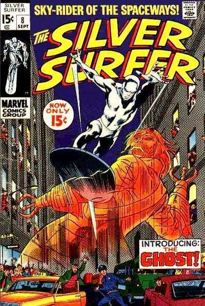
Silver Surfer #8 (September 1969)
"Now Strikes the Ghost!"
Stan Lee-John Buscema/Dan Adkins
Raise your hand if you have a love/hate relationship with the Silver Age Silver Surfer. He's a cool character - to that we can all agree. But if you've ever sat and read a lengthy stretch of his solo series, you may have needed therapy. It is one of the most annoying, even somewhat depressing, runs of any comic I've ever read. In the hands of Stan Lee, the Surfer is moodily over-written. I think if I'd purchased the books off the spinner racks when they were bi-monthly I could have put up with it. But reading from an Epic Collection, Masterworks, etc. is just too much. Am I wrong?
So what we have here today, friends, is a bit of a twofer. I read from the softcover Silver Surfer Marvel Masterworks, volume 2, and used a few scans from it to place alongside photographs from IDW's John Buscema's Silver Surfer Artist Edition. Who doesn't need a splash of color every now and then? Let's get after it...
100-Word Review:
Always seeking a way to torment the Silver Surfer, Mephisto schemes a new plot to win the hero’s soul. Finding a human through which to create a conduit to Limbo, the demon is able to summon a once-dead ship’s captain from centuries ago: the Flying Dutchman! After hearing how the Dutchman had lived a hateful, self-centered life and had made a deal with the devil, Mephisto imbues him with power enough to battle the Surfer. But will this new Ghost prove up to the task? And what of the Surfer’s continued quest to reunite with his love, Shalla Bal? Will the Ghost ruin that wish?


The Good: I love it when characters behave just as we'd expect them to. But wait, you say - above, it was stated that the Silver Surfer could be a tired character. Yes indeed - and that's not who I am staring with. I want to focus on Mephisto. You know, for most folks the Surfer is so closely associated with Galactus, and then perhaps Dr. Doom. But you know who turns up continually in the Surfer's solo mag? The Prince of Darkness himself. I'd go so far as to say he should get a supporting-actor credit. I'm not sure his whole angle about having to find the devil-worshipper in order to create a gateway to bring the undead back to life (wait...) made sense, but then I suppose the supernatural doesn't have to make sense. Probably better just to roll with it.
The backstory of the Flying Dutchman and the creation of the Ghost was well done. I liked the rationale for the character, growing from his past motivations. The Ghost was enough different - and super-creepy - to be an effective updating of the former ship's captain. I even thought it was interesting that he'd get around on his former watercraft.


John Buscema's splash page as the Dutchman is revived was powerful, both in the original art as well as the colored version. It might have been a bit more effective, however, with more blacks in the background. But what do I know. Buscema did a marvelous job of taking this dead body and reanimating it in such a way that the two characters looked similar.


The half-splash when the Ghost is revealed, with a little Kirby Krackle in the first panel, was also pretty awesome. One can almost smell the brimstone from all that swirling smoke!

Lastly, that the Silver Surfer hardly appeared in his own mag, but it was still a fun issue, was the mark of an effective plot and execution.


The Bad: I don't have much to say here, as usual. I think I'd just reiterate the vibe I was sending above when I remarked that sometimes this series just wore on a reader. If there was one thing we could count on, it was Norrin Radd's incessant pining for Shalla Bal. And guess what? We got a 2-page vignette of just that in this story! Thank goodness Shalla is so beautifully rendered by Big John. In the hands of a lesser artist, I'd have annoying words and a less-pleasing lady to look at.

The Ugly: I don't even know what to call what happened at the end of the story. It's sort of the opposite of the Dreaded Deadline Doom in that we didn't get shorted an original story - instead, we got a cut-in-half tale with the promise of a big finish in the next installment. I tossed this out on Twitter a few weeks ago and asked readers if they thought this was a) crafty marketing or b) a way to draw attention to a magazine with sagging sales. Most respondents scored those choices a tie. I've included all the particulars on the last three art samples, which will enlarge for your perusing enjoyment.


Another nice review, Doug! It's always an interesting touch to compare the Black/White original to the colored version. Gives you a chance to see the strengths of both versions. Of course, Buscema's linework truly needs no color to be effective, as these pages will attest.
ReplyDeleteAnd I'd agree about the Surfer in general- a tendency to be a bit preachy. As for your observation about the prominence of Mephisto in the book, it led me to another little point. Perhaps one reason the Surfer's book didn't really click was the basic lack of a supporting cast. Think of Marvel's other books; Spidey, DD, FF, just about all of them had strong backup characters to flesh out the story. With the Surfer, we get some guest stars but nobody the Surfer can play off of. Granted, part of the Surfer's story is that isolation, but still...
Great point on the supporting cast. The Surfer could have used a "regular person" to ground him, somewhat as it seemed might happen with Alicia Masters near his debut. But what do I know?
DeleteDoug
I remember reading the reprints of Surfer's original series in the revived Fantasy Masterpieces and liking them well enough. Of course, much of that had to do with Buscema's art. More recently, I've read the first five issues in - you guessed it - my handy-dandy Panini digest. I still like them, apparently more than you, but I would agree that you should probably not read them one after the other. In fact, that's what I did, i.e., I read one, and then read other stuff, and only came back to it a few days later at least.
ReplyDeleteRed makes a good point about the possible lack of a supporting cast who could play off of the Surfer as something that could have improved the stories and cut down on the Surfer's rather mopey monologues.
As to artist's edition on review, it certainly looks nice - but then again, Big John's work always looks good, doesn't matter if it's in color or b&w.
I also have that Panini digest, Edo. I think the first 5 issues are OK. It's when the series heads toward double-digits that it becomes a slog. But the art is always pretty.
DeleteDoug
Hi Doug, Hi Edo, Hi Redartz,
ReplyDeleteOf all the gin joints……
I hope you’re all well. It’s been a few years, so I won’t be offended if you don’t remember me from BAB. Mind if I play in your sandbox?
I agree about the background inking, Doug. One of my pet peeves is so called ‘black and white’ photography which is actually just colour photography with no colour. Pictures composed as B&W images are an art form in themselves, where the lighting is everything. Don’t even get me started on the word ‘noir’.
So many of the silver age Marvels are Lee/Kirby, I always feel a special warmth to the ones that are not - Spidey, Doc Strange and DD at the start and the Surfer kind of bookends the decade as the last great piece of Stan’s writing and a last hurrah to the Silver age before it segues into Bronze.
Did Big John ever look better than this? I can remember being stunned by his artwork when he took over Avengers (#41), so fluid and detailed compared to Heck’s, but this run would take some beating. We should mention some sterling work by Dan Adkins too, I think. He was never a Palmer, Giordano, Janson or an Austin, but he did some lovely work over Big John and he was my favourite inker for Kane.
In the UK, American Marvels were reprinted in B&W, so I read all of these in B&W in the first place. Although I caught up to colour (excuse me, color) US originals with most other things, you can imagine it was many years until I had a full set of Silver Surfer originals. So looking these in B&W now is….well, it’s just how they always looked. I loved these stories so much which is odd considering I was only 8 or 9 when I started them which seems too young for something so plaintiff and metaphorical. SS was printed in a comic with X men which I thought was really weird and didn’t like for some reason. Live & learn!
Nice to be back,
Richard
It is most excellent to hear from you, Richard! All points per B&W art for the magazines are well taken.
DeleteDon't be a stranger -
Doug
Hiya,
ReplyDeleteI'm not sure but I believe that the reason why the story seems a bit truncated is because the previous issues were almost twice the size of the average comic book. Perhaps it was written and drawn initially for publication as a whole and complete story and not the two parter that it was presented as. The cover's price notification might bare this out.
This might be almost sacrilegious, but perhaps the art is simply too attractive for the tonality of this story. Demons and their worshipers and the ghosts of the damned might have been better served under the brush of Tom Palmer rather than the equally talented if stylistically different Adkins.
Just my thoughts.
Seeya,
pfgavigan
PFG - I always enjoy your commentary on inkers. You always give me reason to pay more attention than I might ordinarily.
DeleteDoug
This comment has been removed by the author.
ReplyDelete